Exploring how we can bridge the gap between blockchain and frictionless UX, through human-centric design

SEQUOIA
Sequoia Investors weren’t crypto natives but they were keen on their growth strategy – requiring visibility on trends happening within crypto so they could explore, learn, + act accordingly. I created a dashboard designed for data analytics and with a back-end pumping all streams on the blockchain.


There was an original UI that was cluttered & non-intuitive, designed mainly for Web2 outlooks and it overwhelmed investors with raw data in a infinite scroll – mostly usable only to data science developers and not future-proof for Crypto & Web3 analytics.
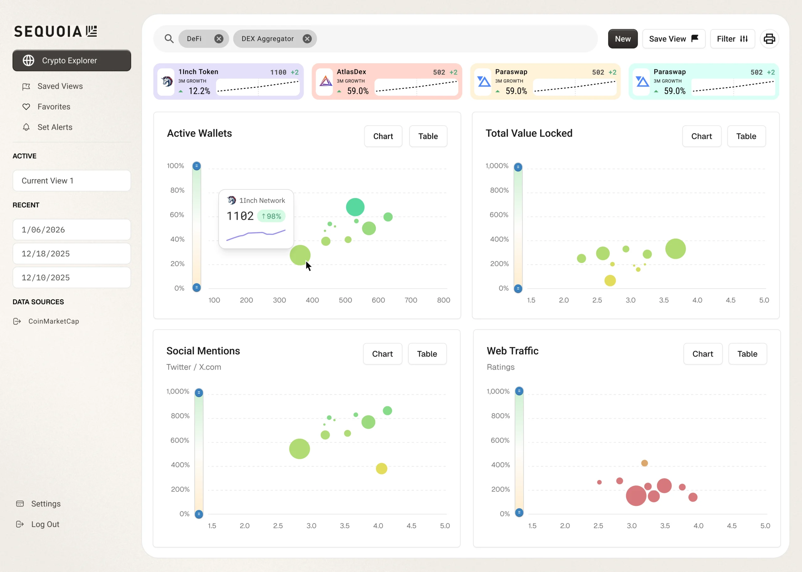
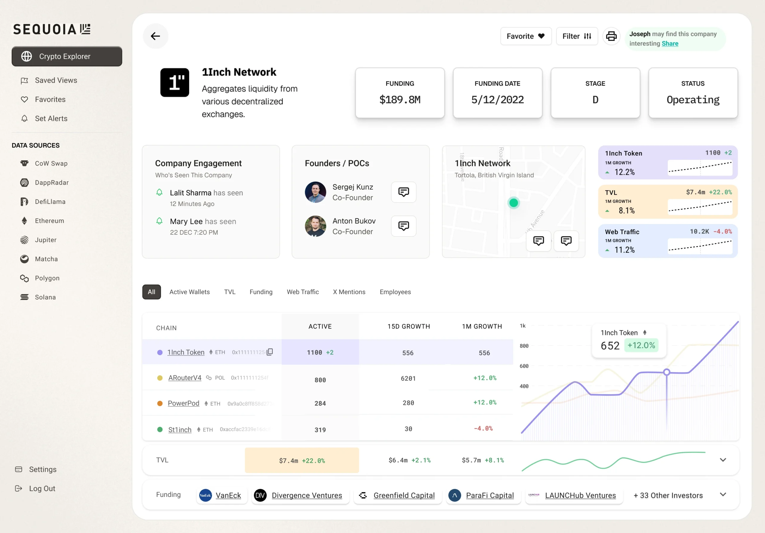
Dashboard was re-architected around two core surfaces: a powerful Explorer allowing analysts to dynamically segment and query for companies across categories & multi-source datasets and create high-signal Company Profile pages that surface active metrics and key performance indicators above the fold that enable investors to rapidly build conviction within minutes.
THE MODULES
We simplified DeFi by transforming complex blockchain data into actionable insights.
Smarter Crypto Analytics With Real-Time On Chain Intel
Tracking tokens, liquidity, and routing across DEXs to reveal how trades are optimized in real-time (and what’s happening behind every swap).
HIGH-VALUE SIGNALS
We did more than showcase the blockchain activity, we combined all valuable accessible data across Web2 to provide context on whether the on-chain activity was real and purpose-driven or not.
THE DESIGN
We simplified DeFi by transforming complex blockchain data into actionable insights.